← A Level Economics Revision · Home

The LRAS shift diagram (long-run growth) — A-Level Economics
Play the game and get tested on every point of the diagram — every wrong answer gets a diagnosis. Then study the answers below. Measure what you don’t know, then fix what you don’t know.
The diagram
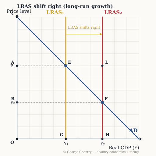
A supply-side policy raises the quantity and quality of the factors of production, so long-run aggregate supply shifts right from LRAS₁ to LRAS₂. AD never moves. The equilibrium slides down AD from E (P₁, Y₁) to F (P₂, Y₂): real output rises and the price level falls. Point L is the trap — the output level of LRAS₂ at the OLD price level, which is not on AD and so is not an equilibrium.
The game’s questions — with the answers explained on the diagram
These are the exact questions the game asks. Play first if you want the real test — or study them here with the answer for each one.
1. Which of these shifts LRAS right from LRAS₁ to LRAS₂?
Government spending on education and retraining, raising the quantity and quality of the labour force. LRAS is the economy’s maximum productive potential, so it moves only when the factors of production themselves change — labour, capital, technology. Education, infrastructure, investment, deregulation, weaker union power: different policies, one shift. Consumer confidence and the exchange rate move AD; a rise in oil prices moves SRAS.
2. LRAS shifts right to LRAS₂ and AD is unchanged. Which point is the new macroeconomic equilibrium?
Point F. The economy always settles where AD meets AS. LRAS₂ is vertical at Y = 7 and AD crosses it at F: real output 7, price level 3. Point L sits at the right quantity but the wrong price level — it is not on AD, so it is not an equilibrium. That is the single most common error on this diagram.
3. Which point on the price axis is the new price level after the LRAS shift?
Point B. Read across from the new equilibrium F to the price axis: the price level falls from P₁ (point A) to P₂ (point B). With more capacity available, firms compete less aggressively for the same fixed pool of labour and capital, so wage and input-price growth slows and the price level falls.
4. Output rises from Y₁ to Y₂ while the price level FALLS. Why does inflation fall rather than rise?
Because with more factors of production available, firms compete less aggressively for the same fixed pool of labour and capital, so unit costs and cost-push inflation fall. Point, cause, consequence: LRAS right → more factors of production available → less competition for the same fixed pool → wage and input-price growth slows → cost per unit falls → the price level falls from P₁ to P₂. And because unit costs are down, exports get cheaper in foreign-currency terms, so international competitiveness improves too. Direction depends on WHICH curve moved: output driven by an AD shift would raise the price level instead.
5. Evaluation: why is supply-side policy said to have no trade-off — the closest economics comes to a free lunch?
Because growth rises, unemployment falls, inflation falls and the trade position improves — all at once. Demand-side policy always forces a choice: stimulate the economy and you risk inflation; cool inflation and you risk unemployment. Supply-side policy has no such trade-off. On this diagram output rises to Y₂, unemployment falls through the greater derived demand for labour, cost-push inflation falls to P₂, and cheaper exports improve the trade position. Four objectives, one shift. The honest counter is the evaluation: severe time lags, a large opportunity cost, and no guarantee the shift actually happens — firms can spend a tax windfall on dividends or debt instead of investment.
Now test yourself
Every point on this diagram has a letter. Answer with the points and the distances, exactly like the exam. Every wrong answer gets a diagnosis — that is the diagram telling you what to fix.