← A Level Economics Revision · Home

The short-run Phillips curve diagram — A-Level Economics
Play the game and get tested on every point of the diagram — every wrong answer gets a diagnosis. Then study the answers below. Measure what you don’t know, then fix what you don’t know.
The diagram
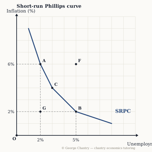
Unemployment runs along the horizontal axis; inflation runs up the vertical one. The downward-sloping curve is the short-run trade-off: in the short run you can have lower unemployment or lower inflation, but demand-side policy alone cannot give you both. At A unemployment is 2% and inflation 6%; at B unemployment is 5% and inflation 2%. G — 2% unemployment with 2% inflation — sits below the curve, which is precisely the combination the short-run trade-off says you cannot have. F sits above and to the right: higher unemployment and higher inflation together, which is what a cost shock does.
The game’s questions — with the answers explained on the diagram
These are the exact questions the game asks. Play first if you want the real test — or study them here with the answer for each one.
1. Which point shows low unemployment with high inflation?
A — 2% unemployment, 6% inflation. Unemployment is on the horizontal axis, so “low unemployment” means far left; inflation is on the vertical axis, so “high inflation” means high up. The dashed guides do the reading for you.
2. The economy moves along the curve from B to A. What has happened?
A demand-side boom: aggregate demand rises, output and employment rise, and inflation rises with them. Labour is derived demand — more demand for goods and services means more workers are needed, so unemployment falls — while the demand-pull pressure pushes prices up. That is what the short-run Phillips curve exists to show: the trade-off demand-side policy forces on you.
3. Read the co-ordinates: at point B, what are unemployment and inflation?
5% unemployment and 2% inflation. Take every point in two steps: straight down to the unemployment axis for the first number, straight across to the inflation axis for the second. Getting the axes the right way round is worth a mark on its own.
4. The central bank raises interest rates to bring inflation down. What does the diagram say it costs?
Lower inflation, but higher unemployment — a movement from A towards B. Contractionary monetary policy cuts aggregate demand, so inflation falls but growth falls and unemployment rises with it. How bad the trade-off is depends on where you are: with a lot of spare capacity it is brutal; with little spare capacity you can bring inflation down relatively cheaply. Naming the trade-off and then judging its severity is where the evaluation marks sit.
5. Evaluation: energy prices spike, so firms’ costs jump. Which point shows the outcome the short-run trade-off cannot deliver?
F — 5% unemployment and 6% inflation. The short-run trade-off is a demand-side story, in which one objective improves as the other worsens. A cost shock breaks it: short-run aggregate supply shifts left, so prices rise while real output falls and unemployment rises. Both objectives worsen at once, which is exactly why cost-push inflation is treated as the worse kind — it arrives alongside a recession. Diagnose which kind of inflation you are looking at before you prescribe anything.
Now test yourself
Every corner has a letter. Answer with the points and areas, exactly like the exam. Every wrong answer gets a diagnosis — that is the diagram telling you what to fix.