← A Level Economics Revision · Home

The maximum price diagram — A-Level Economics
Play the game and get tested on every point of the diagram — every wrong answer gets a diagnosis. Then study the answers below. Measure what you don’t know, then fix what you don’t know.
The diagram
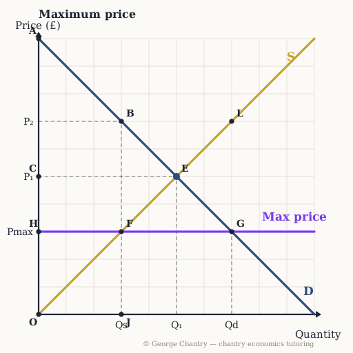
The dashed line is the maximum price, Pmax, set below the free-market equilibrium E (P₁, Q₁). At the capped price the supply curve gives Qs (point F) while the demand curve gives Qd (point G): the horizontal gap between them is the shortage. Only Qs actually trades — the short side of the market wins.
The game’s questions — with the answers explained on the diagram
These are the exact questions the game asks. Play first if you want the real test — or study them here with the answer for each one.
1. A maximum price of £3 is imposed (for example a rent cap). Which point shows the quantity actually traded?
F. The short side of the market wins: at £3 buyers want 7 (point G) but sellers only offer 3, so only 3 trades happen. You can’t buy what nobody sells. (The classic error is answering G — that is quantity demanded, and wanting isn’t getting.)
2. Which distance shows the shortage the cap creates?
The distance F G — measured horizontally at the capped price: quantity demanded 7 minus quantity supplied 3 = 4 units of unmet demand. That gap is why price caps bring queues, waiting lists and black markets.
3. When does a maximum price actually cause a shortage?
Only when it is set below the equilibrium price. Below equilibrium it binds: price can’t rise to clear the market, so excess demand persists. Set above equilibrium the market price never touches it — a ceiling above your head.
4. With the cap in place, which area is consumer surplus?
A B F H — under D, above £3, out to the 3 units traded. The A* caveat: this assumes the 3 units reach the buyers who value them most, and queues and black markets may break that. Whether the right consumers get them is your evaluation point.
5. With the cap in place, which area is producer surplus?
H F O — above S, below the cap, anchored at the origin: sellers get £3 on just 3 units. Far smaller than O C E before, and producers are the clear losers from a cap — that squeeze is why supply dries up under rent controls.
6. Which area is the deadweight welfare loss from the cap?
The triangle B E F. Between Q = 3 and Q = 5 willingness to pay (D, from B) exceeds cost (S, from F), so those trades are banned by the cap: surplus destroyed, the triangle pointing at equilibrium E. (The classic error is drawing it the wrong way round — the lost trades sit before equilibrium, not after.)
Now test yourself
Every corner has a letter. Answer with the points and areas, exactly like the exam. Every wrong answer gets a diagnosis — that is the diagram telling you what to fix.