← A Level Economics Revision · Home

The Lorenz curve diagram — A-Level Economics
Play the game and get tested on every point of the diagram — every wrong answer gets a diagnosis. Then study the answers below. Measure what you don’t know, then fix what you don’t know.
The diagram
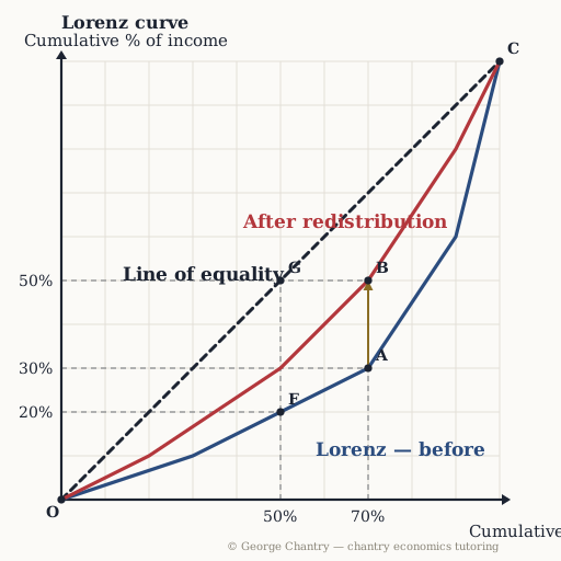
Cumulative percentage of the population runs along the horizontal axis; cumulative percentage of income runs up the vertical one. The straight 45° line is the line of perfect equality — on it, each x% of the population would receive exactly x% of the income, so the poorest 50% would take 50% (point G). Real distributions sag below it: on the blue curve the poorest 50% take only 20% (point F) and the poorest 70% only 30% (point A). Redistribution pulls the curve in towards the line — the gold arrow runs curve to curve at one fixed population share, lifting the income share of the poorest 70% from 30% to 50% (point B).
The game’s questions — with the answers explained on the diagram
These are the exact questions the game asks. Play first if you want the real test — or study them here with the answer for each one.
1. What does the straight 45° line represent?
Perfect equality — every x% of the population receives exactly x% of the income. No real economy looks like that; the line is the yardstick everything else is measured against. The Lorenz curve is the actual distribution, and the distance between line and curve is the inequality.
2. Which point shows the share of total income going to the poorest 70% of the population before redistribution?
A. Straight up from 70% on the population axis to the blue curve, then across to the income axis: 30%. The bottom 70% take under a third of the income. (B is the same share after redistribution; G sits on the line of equality — what they would get if income were shared equally, not what they actually get.)
3. Which curve shows the more unequal distribution of income?
The blue curve — it sags further away from the line of equality at every population share. The rule is one sentence: the further the curve bows away from the line of perfect equality, the more unequal the distribution, and the higher the Gini coefficient. Closer to the line means more equal, not less.
4. Progressive income tax funds transfer payments — the Robin Hood move. What does that do to the Lorenz curve?
It pulls the curve inward, towards the line of perfect equality, so the Gini coefficient falls towards 0. Chain it: progressive rates → disposable income of the rich falls → the revenue funds transfers → incomes at the bottom rise → the distribution narrows → the curve moves in → Gini towards zero. Cut benefits instead and the curve moves back out and the Gini rises towards one.
5. Evaluation: what does the Gini coefficient actually measure?
The distance between the line of perfect equality and the Lorenz curve, expressed as a number between 0 and 1: 0 means everyone is equal, 1 means one person owns everything. A small distance means a small Gini means a more equal distribution. The UK income Gini is about 0.343; wealth is distributed far more unequally still, at roughly 0.62 — worth quoting, because it separates income inequality from wealth inequality.
6. Which distance shows how much redistribution raised the income share of the poorest 70%?
A to B — the vertical gap between the two curves at one fixed population share, 30% of income becoming 50%. Measure this shift the way you would measure a shift in supply: fix one point on the horizontal axis and read the vertical gap. (F to G is the gap between the actual distribution and perfect equality at 50% — the inequality itself, not the effect of the policy.)
Now test yourself
Every corner has a letter. Answer with the points and areas, exactly like the exam. Every wrong answer gets a diagnosis — that is the diagram telling you what to fix.