← A Level Economics Revision · All Lorenz curve questions · Home
A-Level Economics · Lorenz curve diagram question
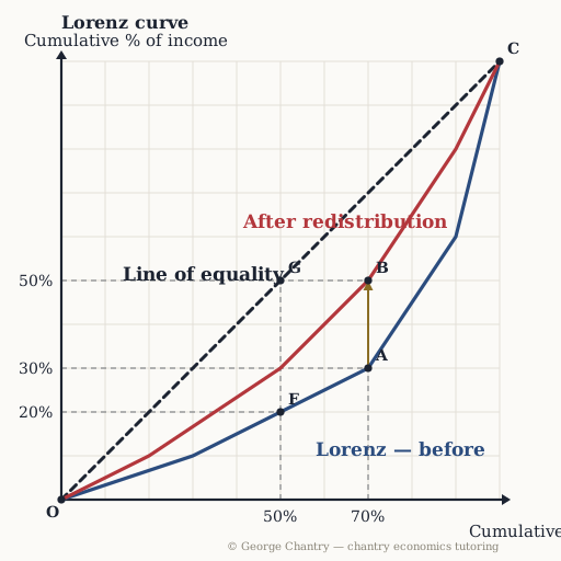
Which curve shows the MORE unequal distribution of income?
The diagram
The answer
The blue curve — it sags further away from the line of equality. Inequality is distance from the line. Blue sits further out at every population share, so blue is the more unequal distribution — and the higher Gini. The rule is one sentence: the further the curve bows away from the line of perfect equality, the more unequal the distribution. Blue lies outside red at every population share, so blue is the more unequal of the two.
Test yourself properly
This is one of 6 questions on the lorenz curve diagram — every corner lettered, every wrong answer diagnosed.
▶ Play the lorenz curve game All questions & answers

George Chantry
Professional A-Level Economics tutor · Oxford PPE First, 3 prizes in economics · 7,000+ hours one-to-one