← A Level Economics Revision · Home

The Laffer curve — A-Level Economics
Play the game and get tested on every point of the diagram — every wrong answer gets a diagnosis. Then study the answers below. Measure what you don’t know, then fix what you don’t know.
The diagram
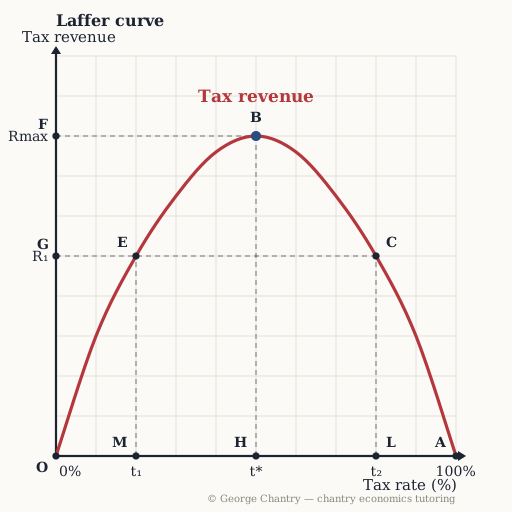
Tax revenue goes on the vertical axis, the tax rate on the horizontal. Revenue is zero at a 0% rate (point O) and zero again at 100% (point A), because nobody would make anything. Connect those two points and there must be a maximum in between: B, the revenue-maximising rate t*, giving Rmax. Point C sits past the peak on the downward-sloping section — and raises exactly the same revenue as the far lower rate at point E.
The game’s questions — with the answers explained on the diagram
These are the exact questions the game asks. Play first if you want the real test — or study them here with the answer for each one.
1. Which point on the curve is the revenue-maximising tax rate?
Point B. The revenue-maximising rate is the top of the inverted U — point B, at rate t*, giving Rmax. Read it down to the rate axis and across to the revenue axis. Below t* you are still climbing; above t* you are throwing revenue away. Point A is the 100% rate, where revenue is zero: the highest rate is emphatically not the highest revenue.
2. Why is tax revenue zero at both ends of the curve — at a 0% rate AND at a 100% rate?
At 0% the government takes nothing; at 100% nobody would produce anything, so there is nothing to take. Both endpoints are agreed by everybody. At a 0% rate the government collects no revenue by construction. At a 100% rate no one would make anything, because every pound earned is taken — no output, so no tax base, so no revenue. Those two zeros are what the whole diagram is built from.
3. Why must a revenue-maximising tax rate exist somewhere between the two ends?
Because revenue is zero at 0% AND at 100% but positive in between — connect the dots and there has to be a maximum. Start from the endpoints, then observe that in between the government clearly collects something. The curve must therefore rise and then come back down, so it must peak. Note what the diagram does NOT tell you: where t* actually sits. That is the honest limit of the model, and it is worth saying in an evaluation.
4. The economy is at point C, past the peak. The Chancellor raises the rate further. What happens to revenue?
It falls — the economy slides further down the curve, away from the maximum at B. Beyond the revenue-maximising rate, raising the rate lowers the government’s own revenue. Three mechanisms: the income effect, where workers hit a satisfactory target income with fewer hours and so work less; tax evasion and avoidance becoming worth the trouble; and highly skilled workers and entrepreneurs emigrating to lower-tax jurisdictions. That last one bites hardest where the top 1% pay around 30% of all UK income tax — roughly £59 billion. The redistributive purpose of the rise is undermined alongside the revenue purpose.
5. Point C raises exactly the same revenue as which other point — and why does that matter?
Point E. Read across from C at R₁ and the horizontal guide hits the curve again at point E, the far lower rate t₁. Both rates raise identical revenue — but the low-rate route gets there without discouraging work, without pushing people into evasion and without driving high earners abroad. That symmetry is the sharpest version of the Laffer argument, and a strong evaluation line in any “should the government raise the top rate?” essay.
Now test yourself
Every point on this diagram has a letter. Answer with the points and the distances, exactly like the exam. Every wrong answer gets a diagnosis — that is the diagram telling you what to fix.