← A Level Economics Revision · Home

The tariff diagram — A-Level Economics
Play the game and get tested on every point of the diagram — every wrong answer gets a diagnosis. Then study the answers below. Measure what you don’t know, then fix what you don’t know.
The diagram
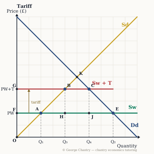
Under free trade the world price PW sits below the domestic no-trade price at K, and cheap imports fill the gap: domestic supply reaches only Q₁ (point A) while domestic demand extends to Q₂ (point E), so imports are the distance A–E. A tariff — a tax on imports — lifts the world supply line from Sw to Sw + T, raising the price to PW+T. Domestic supply now extends to Q₃ (point B) and domestic demand contracts to Q₄ (point C), so imports are squeezed to B–C. The government collects the rectangle H J C B; triangles A B H and J C E are the two welfare losses.
The game’s questions — with the answers explained on the diagram
These are the exact questions the game asks. Play first if you want the real test — or study them here with the answer for each one.
1. Under free trade the world price is PW. Which distance shows imports before the tariff?
A–E. Talk about excess demand before you talk about imports. At PW domestic supply reaches only A (Q₁) while domestic demand extends to E (Q₂). World supply is perfectly elastic at PW, so the shortfall A–E is filled completely by foreign producers — that is the imports.
2. Which distance shows imports after the tariff?
B–C. The tariff lifts the price to PW+T, and both blades of the scissors close on imports: domestic supply extends from Q₁ to Q₃ (A up to B) and domestic demand contracts from Q₂ to Q₄ (E back to C). Because domestic output has risen and labour is a derived demand, domestic employment rises — that is the chain the examiner wants next.
3. Which area is the government’s tariff revenue?
The rectangle H J C B. The government only collects on units that still cross the border, so revenue equals the tariff per unit (PW+T minus PW) multiplied by the imports that remain, Q₃ to Q₄. The heuristic for reading any of these diagrams: if it is revenue it is a rectangle; if it is surplus it is a triangle.
4. Which area is the deadweight loss on the production side?
The triangle A B H. Behind the tariff wall the country produces units it has no comparative advantage in. Between Q₁ and Q₃ the cost of making them at home runs up the Sd curve, above the world price PW at which they could simply have been bought. That gap is resources wasted — the United States can make steel, it just is not the best place in the world to make it.
5. Which area is the deadweight loss on the consumption side?
The triangle J C E. After the tariff the market shrinks: fewer units are produced and traded. Between Q₄ and Q₂ there was trade that would have been mutually beneficial — willingness to pay on Dd sat above the world cost PW — and the tax has made it impossible. Those are lost gains from trade, and consumer surplus is cut hard on top.
6. Evaluation: who actually pays for the tariff?
Domestic consumers. Follow the money. Consumers pay PW+T instead of PW and cut back from Q₂ to Q₄. Part of what they lose becomes domestic producer revenue, part becomes government revenue H J C B, and the two triangles are destroyed outright. That is the deeper point that earns marks: a government protects on behalf of its own producers and workers, while free-trade economists answer on behalf of consumers — who are the majority. And retaliation can take the exports too, which is why the US–China exchange at roughly 145% and 125% is a negative-sum game.
Now test yourself
Every corner has a letter. Answer with the points and areas, exactly like the exam. Every wrong answer gets a diagnosis — that is the diagram telling you what to fix.