← A Level Economics Revision · Home

The subsidy diagram — A-Level Economics
Play the game and get tested on every point of the diagram — every wrong answer gets a diagnosis. Then study the answers below. Measure what you don’t know, then fix what you don’t know.
The diagram
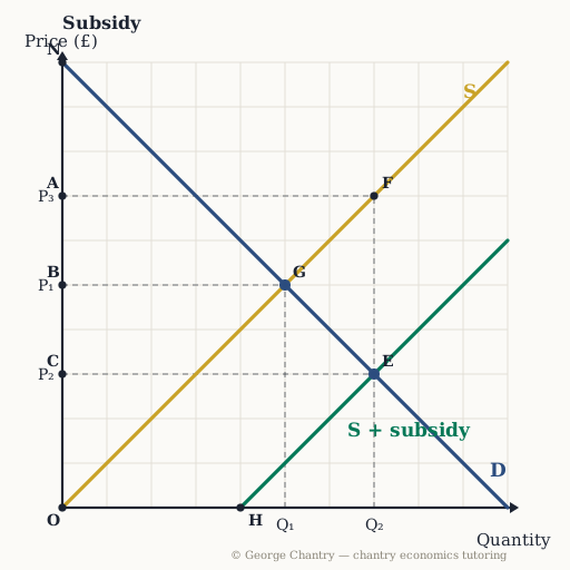
The subsidy shifts supply right from S to S + subsidy — the vertical distance between the two supply curves (F down to E) is the subsidy per unit. The market moves from the old equilibrium G (P₁, Q₁) to the new equilibrium E (P₂, Q₂). The consumer now pays only P₂; the producer, once the government adds the subsidy, receives P₃.
The game’s questions — with the answers explained on the diagram
These are the exact questions the game asks. Play first if you want the real test — or study them here with the answer for each one.
1. A £4-per-unit subsidy shifts S down to S + subsidy. Which point on the price axis do consumers now pay?
C. Where S + subsidy crosses D (point E), read across to the price axis: the price falls to £3 and quantity extends to 7. The chain is subsidy → supply shifts right → price falls → extension of demand.
2. Which point on the price axis do producers receive per unit (price + subsidy)?
A. £3 from the buyer plus £4 from the government = £7 — found on the original supply curve at the new quantity, point F. (The classic error is swapping the two, and handing producers what the consumer pays.)
3. Which area is total government spending on the subsidy?
The rectangle C E F A — subsidy per unit (£7 − £3) × the new quantity of 7, between the two prices. Part of it becomes consumer surplus and part producer surplus, but the spending is bigger than the surplus it creates: triangle G F E, pointing at the old equilibrium, is pure loss.
4. Which area is consumer surplus after the subsidy?
N C E — below D, above the new price of £3, out to quantity 7: bigger than before on both dimensions. Compare it with N B G before the subsidy — the growth in consumer surplus is one of your three or four talking points on this diagram.
5. Which area is producer surplus after the subsidy?
O A F — above the original supply curve, below the £7 producers now receive, out to point F. It is measured off the original S because their true costs did not change; before the subsidy it was O B G.
Now test yourself
Every corner has a letter. Answer with the points and areas, exactly like the exam. Every wrong answer gets a diagnosis — that is the diagram telling you what to fix.