← A Level Economics Revision · Home

The PPF outward shift (economic growth) diagram — A-Level Economics
Play the game and get tested on every point of the diagram — every wrong answer gets a diagnosis. Then study the answers below. Measure what you don’t know, then fix what you don’t know.
The diagram
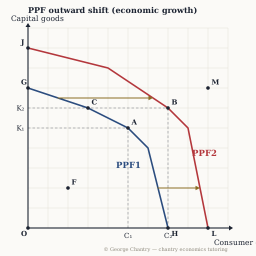
A rise in the quantity and quality of the factors of production shifts the whole frontier outwards from PPF1 to PPF2. The gold arrows run frontier to frontier at one fixed level of capital goods — that is how a shift is drawn, and it is what makes the claim “more of both goods is now possible” visible. The economy moves from a production point A (C₁, K₁) to a production point B (C₂, K₂), which lies outside the old frontier altogether. F sits inside PPF1 — idle resources — and M lies outside both frontiers, so it is still unattainable.
The game’s questions — with the answers explained on the diagram
These are the exact questions the game asks. Play first if you want the real test — or study them here with the answer for each one.
1. The frontier shifts out from PPF1 to PPF2. What causes that?
A rise in the quantity and quality of the factors of production — more capital, better technology, better-trained labour. Route every driver of long-run growth back to that one sentence: investment in modern machinery, investment in education and training, and the productive potential of the economy rises. Anything that works through demand instead moves the economy within the frontier, not the frontier itself.
2. Which point was unattainable before the growth, but is attainable once the frontier has shifted out to PPF2?
B. It lies outside PPF1 but on PPF2 — at 7 consumer goods the old frontier offered no capital goods at all. Unreachable yesterday, reachable today: that is exactly what an outward shift means. (M lies outside both frontiers, so it is still out of reach even after the growth.)
3. Which point shows an economy with idle resources — unemployed workers and unused capital?
F. Inside the frontier, the economy could have more of both goods without giving anything up. That is waste, not scarcity. This is the one diagram where meaningful points sit off the curve: inside and outside are the lesson.
4. What is the difference between actual and potential growth on this diagram?
Actual growth is moving from F towards the frontier; potential growth is the frontier itself shifting from PPF1 to PPF2. Two different moves, two different stories: using spare capacity you already have, versus building more capacity. Say which one you mean, every time — the examiner is checking.
5. The gold arrows run from PPF1 out to PPF2 at one fixed level of capital goods. Which arrow would be wrong for economic growth?
Arrows running inward, from PPF2 back to PPF1. That is the picture of an economy losing capacity — war, natural disaster, mass emigration. Draw it when you mean growth and you have argued the opposite of your own paragraph. Growth moves the frontier away from the origin, so every shift arrow runs outward, curve to curve, at one fixed level. (A vertical arrow at one fixed level of consumer goods is equally valid — the rule is one level, not one direction on the page.)
Now test yourself
Every corner has a letter. Answer with the points and areas, exactly like the exam. Every wrong answer gets a diagnosis — that is the diagram telling you what to fix.