← A Level Economics Revision · Home

The free trade diagram (imports) — A-Level Economics
Play the game and get tested on every point of the diagram — every wrong answer gets a diagnosis. Then study the answers below. Measure what you don’t know, then fix what you don’t know.
The diagram
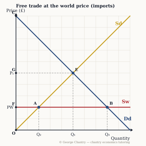
Without trade the market settles where Sd crosses Dd — point E, price P₁ and quantity Q₁. Open the economy and world supply arrives, perfectly elastic at the world price PW: the price falls, domestic supply contracts along Sd to Q₂ (point A) and domestic demand extends along Dd to Q₃ (point B). The gap between them is excess demand, and imports fill it — the distance A to B.
The game’s questions — with the answers explained on the diagram
These are the exact questions the game asks. Play first if you want the real test — or study them here with the answer for each one.
1. Before any trade, which point is the no-trade (autarky) equilibrium?
E — where Sd crosses Dd, at price P₁ and quantity Q₁. Autarky means no foreign trade, so the only price that clears the market is the domestic crossing. Everything else on this diagram happens after the world price arrives.
2. The economy opens to free trade at the world price PW. Which distance shows imports?
A to B. Sequence it the way it earns marks: world supply is perfectly elastic at PW → domestic supply contracts along Sd to Q₂ (A) and demand extends along Dd to Q₃ (B) → that gap is excess demand → the world fills it. Talk about the excess demand before you talk about the imports.
3. Why does opening this market to trade make domestic consumers better off?
They pay the lower world price PW and buy a larger quantity — Q₃ instead of Q₁. PW sits below the autarky price because it reflects the comparative advantage of the world’s lowest-opportunity-cost producers. Lower price and higher quantity together mean consumer surplus expands materially.
4. Which area is the gain in consumer surplus from opening to trade?
G E B F. Do it before-and-after: consumer surplus was the triangle C G E, and is now the larger triangle C F B. The difference is a rectangle from paying PW instead of P₁ on the units they already bought, plus a triangle of surplus on the extra units imports make possible.
5. Which area is producer surplus once the market trades at the world price?
O F A — above Sd, below PW, out to Q₂. Far smaller than O G E before. In an importing sector producers are the losers; the consumer gain outweighs that loss, which is the net welfare gain from trade, but the loss is real and concentrated in one industry. That is where the politics comes from.
6. Evaluation: what is the strongest cost of opening this market to imports?
Structural unemployment in the industry that has lost its comparative advantage. Cheap imports can destroy a domestic industry, and the workers are geographically and occupationally immobile — a 55-year-old miner cannot simply pivot. UK coal in the 1980s is the case: roughly £300 a tonne at home against about £50 imported, and around 100,000 miners lost their jobs. Note what the diagram still says, though — the winners gain more than the losers lose, so in principle the government can tax the winners and compensate the losers.
Now test yourself
Every corner has a letter. Answer with the points and areas, exactly like the exam. Every wrong answer gets a diagnosis — that is the diagram telling you what to fix.